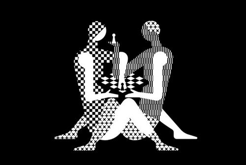
Russian designers create Kama Sutra-like logo for World Chess Championship in London
A Russian design bureau won the competition for the design of the identity of the London World Chess Championship in 2018. However, the Russian logo of the event triggered mixed reactions among the general public.

When the logo was exposed, many grandmasters were outraged with what they saw. World chess players compared the new logo with Kama Sutra and wondered if it could be shown to children.
In addition, the chess board on the logo was pictured as 6x6 cells instead of the traditional 8x8 version of it.
Malcolm Pein, International Director of the English Chess Federation, said that images of people on the logo reminded him of another designer creation, when chess symbols were used to promote a drug similar to Viagra.
According to the World Chess website, the logo created by Russian designers won the competition, because it was found to be "controversial and fashionable, just like London itself."
Some others note that the World Chess Championship is a boring event that will now have an opportunity to attract more attention.
Noteworthy, the logo design of the London Olympic Games had caused a commotion as well, when Iranian representatives claimed that the toothed numbers actually read as the word "Zion," some others saw elements of the swastika on it, and there were also people who claimed that the contemplation of the logo caused them to suffer epileptic seizures.
Pravda.Ru
Photo: Twitter/Kaveh Akbar
Subscribe to Pravda.Ru Telegram channel, Facebook, RSS!


